Inside Apple And IBM's App Making Machine →
Apple helps IBM design enterprise apps by starting projects with a three-day workshop in which they work out the key aspects of the app.
When IBM gets an order for an app such as Passenger+ from one of its enterprise clients, it invites key members of the client’s team in for a three-day workshop at Apple’s Cupertino campus. At the beginning of Passenger+ development, Air Canada sent IT people, managers, and flight attendants to the workshop to hash out the basics.
This is similar to the process we use at Appiphony. Though there isn’t time to sort out every tiny detail in a few days, the group has reached consensus on the core elements of what the app will do and how it will work.
Note the emphasis on talking to the actual end users of the app.
In addition, Apple requires that end users from the client—such as flight attendants in the case of Passenger+—are there to provide their unique view of what they need from an app. The company believes that this step is essential for prompting an immediate “Oh I know how to use that” reaction from the people who will actually use an app, one app designer told me. It also cuts way down on the training time needed to initiate new users.
Miller-Sylvia told me that this insistence from Apple doesn’t always play well. “You can’t imagine how much push-back we get from the client, because the managers think they know,” she says. But “all of the transformation comes from the end users being involved. There’s so many things that they do, and the managers end up getting surprised in the sessions and saying, ‘We had no idea.’”
During one workshop, one of the end users explained: “When I need to do that, I just write it on my hand,” Sylvia-Miller recalls. “And the manager was like, ‘you what?!’” It’s exactly this kind of nitty-gritty day-to-day work reality that gets exposed during the three-day workshops—things a middle manager might never know about.
It’s odd how this is seen as problematic given that it costs so little in time and money, and almost every company talks with customers after products are delivered to gauge customer satisfaction, Net Promoter Scores, etc.
Why Companies Spend Money on Design →
Long story short, because:
Software is eating the world
Millenials have higher expectations
Competition is tougher than ever
How to Write Great “Elevator Pitch” Release Notes Like Amazon
Amazon.com kicks off new product initiatives by writing a hypothetical press release announcing the arrival of the product, then iterating on that message until the vision is sufficiently compelling. It’s a fantastic technique, but it results in a few hundred words. Their release notes, however, provide an example of how to distill that message into a (much shorter) elevator pitch.
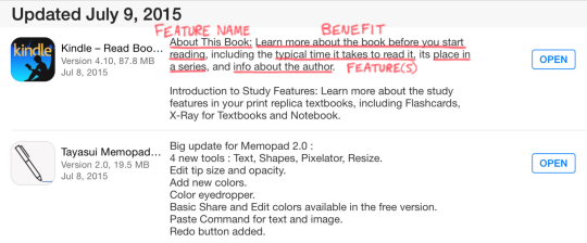
Here’s a recent update to the Kindle app:

First, they introduce the new feature—branding it, if you will. Then, they call out the benefit the feature creates. Finally, they list the actual feature(s) and provide some details on what it does.
The subtle, but critical ingredient here is highlighting the benefit users will get. If you scroll though your app updates, you’ll see that’s few and far between. Most vendors just list the features, like the one that happened to follow Amazon here:

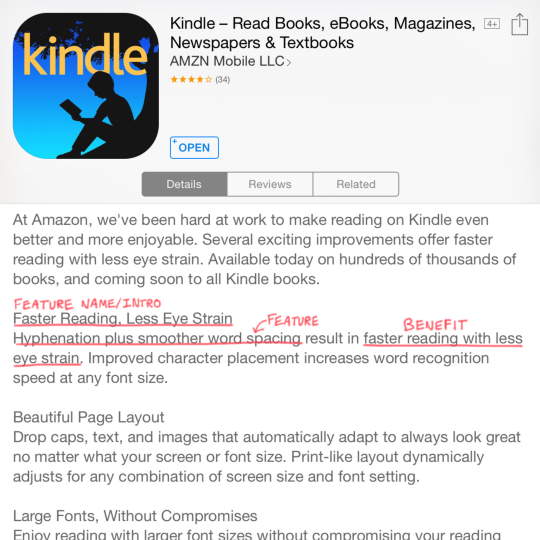
A prior update to the Kindle app followed Amazon’s pattern:

The branding is not as strong, but we still see the benefit—even though improvements to typesetting and visual design can be tough to capture in words.
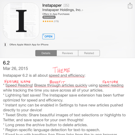
Instapaper had a theme for a recent release, which gave them an easy way to explain why a certain set of features arrived together. Without that, a update can feel like a grab bag with no clear “hook” for customers to understand it holistically.

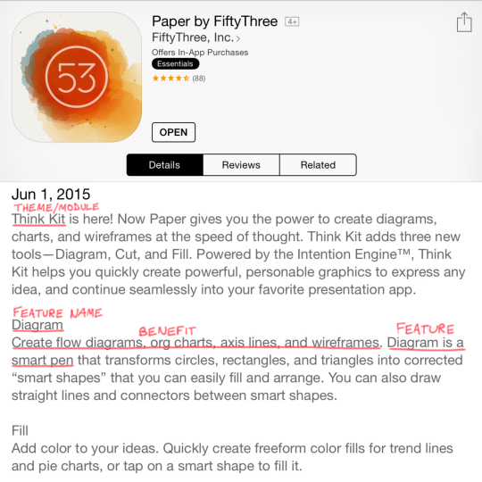
FiftyThree did something similar when releasing a new module for their Paper app. They introduce/brand it, give a quick overview, and then touch on each tentpole feature and the benefit it provides. In their case, that translates to an easier way to accomplish what was tedious in the past.

Adding the “Who”
If you’re building technology for the enterprise, you’ll probably need to include the target user(s) served by the new feature, for example:
System administrators can protect corporate data if a mobile device is lost or stolen with the remote wipe capability introduced with iOS 4.
Once you add that element, you have something that lines up nicely with the Customer-Problem-Solution framework from Lean Startup. If you’re already using that approach, you’ll have a great starting point for this exercise.
Whatever you do, begin with the end in mind so you have more than a list of features when it’s time to ship. Remember: code is a liability. The benefit it creates is the asset.
Becoming Steve Jobs
Becoming Steve Jobs, the new book by Brent Schlender and Rick Tetzeli, is a great read for those that want to know more about the man himself. I came away from the book with an understanding of Steve that was more nuanced and three-dimensional.
Don’t expect to find lots of tips for how to create great products, however. Steve’s story includes that, obviously, but it’s not the focus of the book. Still, two ideas stuck with me:
Maintain your focus on the few pieces that are truly important. Don’t get distracted with the million other things in this world. Say “no” a lot and let other things slide.
Develop an organizing principle—a clear “why”—behind what you’re doing. Your customers will eventually need to hear it, and your team can’t fully get on board with a plan they don’t understand.
So if you want to know Steve, read this book. But if you want to be Steve—and guide smart people to create incredible things—start with Ed Catmull’s Creativity, Inc. I’m planning to go back and re-read it now.
Don’t Stare at the Scoreboard
Analyzing the final product: staring at the scoreboard
Let’s say you’re building a product, and you do some competitive analysis to see how others have addressed the same problem. Sounds reasonable, right?
Here’s the trouble: if you can only look at the final product, and can’t see any of the work that led up to it, you’re missing most of what’s interesting. What trade-offs did the team make based on what they learned along the way? What’s planned for the next release? How did they arrive at their design decisions?
It’s like staring at the scoreboard of a baseball game after it’s over. If you didn’t watch the game, you won’t get much out of it. You missed all the action.
Photos courtesy of Eric Kilby and Keith Allison
Revolutionary Products, Existing Demand
Your product can be the newest, coolest thing around, but it still needs to serve existing demand in the market. Even the iPad was introduced by listing the activities people already do that it improved upon:
Web browsing
Email
Photo management
Watching video
Listening to music
Playing games
Reading eBooks
By itself, the list borders on mundane.
Ash Maurya, a leader in the Lean Startup community, made this great point on the latest episode of the Jobs-to-be-Done podcast. Check that out for more.
The Four Forces of Product Switching
“If only we could get more customers, this thing would really take off.”
Why hasn’t that happened yet? Well, it’s partly because no matter how cool your product is, there are forces conspiring against you.
The Four Forces
There are four forces at play when someone makes a decision to buy or use your product (shown above).
Many companies make an implicit assumption that if their new product has more/better features than a competing product, customers will transition to them. That’s simply not true; features aren’t nearly enough. You need:
Push: The consumer needs to have some problem or dissatisfaction with the solution they’re using now.
Pull: Your product needs to have a compelling feature set, ideally one that speaks to the problem they’re having.
To address Anxiety: Customers won’t implicitly trust you and your offering, and will worry about what bugs/issues they’ll run into.
To address Inertia: People have built up habits that will be hard to break. Installed base, existing integrations and behavior habits are all working against you.
Let’s step though an example to see how this works.
Switching from Android to Windows Phone
Microsoft realizes they’re behind in the smartphone race, and that many new users of Windows Phone will have to be former Android or iOS users. Android seems like the better target, with 22% of Android users surveyed in September 2012 saying they would switch to the iPhone 5 when it was released.
With this in mind, Microsoft released an Android app that scans what’s installed on your phone and recommends a substitute app for Windows Phone. In doing so, they’re addressing the forces of Inertia (“can I do what I’m used to with my phone?”) and Anxiety (“what will I be giving up?”).
So here’s one way the forces could play out:
Push: “This old Android phone as a very glitchy touchscreen.”
Pull: “Wow…this new Nokia is really elegant. It’s very smooth to go from screen to screen.”
To address Anxiety: “I wonder how good the reception is. I’ll keep an eye on that.”
To address Inertia: “Ah, perfect…I can still use Pandora to listen to music.”
If the Push and the Pull are greater than the combined Anxiety and Inertia, then the customer will switch from Android to Windows Phone. If not, they don’t switch. This example also illustrates how the forces play out differently for every individual.
Placing Your Bets
Even though each person experiences the forces in their own way, most of the time you will only release one product. So how do you position your offering for maximum switching?
The good news is, you will almost always see patterns in customer behavior (“everyone hates the glitchy screen”), and you can have some confidence you’re investing in the right areas. Even better, the patterns can emerge with less than 10 customer interviews. But the only way to tease out those patterns is by talking to customers.
You can’t rely on traditional market research, since it focuses on people’s feelings towards the product/brand and does not dive into usage patterns. Interviewing or observing customers is the only way to reliably map out the Push, Inertia and Anxiety your product will face as it enters the market. Don’t you want to know what you’re up against?
In Econ 101 terms, this comes down to understanding everything around the demand for your product. Framing this in terms of supply and demand also helps you see why you shouldn’t iterate your way through this problem. It’s wasteful to simply build something and obtain feedback, since that’s focusing on what you can supply instead of the demand. To gauge the demand, you can focus that more precisely. Figure out what people are doing now.
The Product Thesis →
A concise, easy way to communicate customer needs to design and engineering teams to build the right things.
Answer these questions for the team building your product:
Why are we working on this next?
In what scenario is this used?
What problems do we need to solve?
What future considerations must be accounted for?
How will we know this is a success?
I’ve been thinking about what it means to document and communicate a product at a medium level of grain—between 10,000 feet and the weeds. This helps in that regard.
Keep MVPs Lean, Not Cheap
Would you like to try some dry cake? I didn’t think so.
Instead, make your MVP a cupcake. Be lean, not cheap.
Innovation Defined
If you feel like the word “innovation” is being diluted to the point of meaninglessness, you’re not alone. Thankfully, Horace Dediu has done a nice job of explaining that innovations must be useful, not just new—or even valuable.
When you change the conversation and ask, “what’s useful?” you can talk about the scenarios in which your product gets used. At that point, you’re making real progress towards innovation.
Apps Need to Be (Far) Better
Peter Coffee, Salesforce’s VP for Strategic Research, delivered a keynote at a recent Partner Forum that was essentially one, big call-to-action: create better, more innovative products because customers expect more.
Functionality is driven by customer delight.
User experience is a top priority.
75% of people have spent more for superior service.
Move from damage control to proactive customer care.
Your product can’t just be OK. It’s got to be great.
A User’s Vision of the Future
People do a poor job of predicting the future and prematurely frame it in terms of what they already know.
Moreover, most non-technical people don’t understand what’s possible, and even tech-savvy people have a hard time keeping up with what’s just becoming possible.
This is what happens when you don’t ask “Why?”
Don’t Blow Up the Whale. Ask “Why?”
A recent issue of the MIT Sloan Management Review has a great article on asking “why?” in a corporate setting, as opposed to blindly acting or making assumptions. They also outline the most common reasons why this doesn’t happen:
The action bias: Deadlines are always approaching, so teams often leap into action before the problem is fully identified and assessed.
The familiar solution: “Well, I guess we’ll do what we always do.”
Myopic view of the cause: It’s tempting to assume a single, easily identifiable factor is the cause of a given problem.
Unresolved conflict: Most company cultures are such that disagreements on direction can’t be resolved in the conference room, though they are voiced at the water cooler immediately afterwards.
A hidden agenda: On occasion, a single small subgroup can push an effort forward that doesn’t benefit the wider organization.
Other distractions: Many teams are simply moving too fast to think clearly and recognize higher level issues. If you’re driving 100 mph and spinning out in every corner, you can’t think ahead. You’re just reacting, hoping to avoid a crash.
The article is full of great anecdotes, though my favorite is the story of the Oregon state highway engineers using dynamite to remove the carcass of a gray whale from a beach in a tourist area. This did not work well, but they used dynamite because it was their go-to solution for removing boulders from the road (#2 above).
Teaching Design to Engineers
Designer and Lean UX pioneer Lane Halley posed this question on Twitter:
What do you think? How much UX can and should a “full stack developer” know? laurencegellert.com/2012/08/what-i…@carbonfive
— lane halley (@thinknow) June 7, 2013
The article linked in the tweet states that the true “full stack” developer should have knowledge starting down near the metal, stretching up past the UI, into the user experience and beyond, into the business. (I’m exhausted just thinking about it.)
I fear the person asking this question will not get the outcome they want. Knowledge by itself can’t be a bad thing, though in my experience motivation is the real source of magic. I have some strong opinions on this, because I’ve been fortunate enough to see the results when engineers become excited by shipping products others will value, instead of solving puzzles for their own enjoyment.
The engineer mind
Solving puzzles is where it all starts. When today’s programmers were children, they enjoyed building with Legos, working hard until the pieces fit together. Tomorrow’s programmers are ignoring their meals and debugging their Arduinos as I type this. Why? Because it’s fun! At least, they think so.
Actually, let me rephrase that: It’s fun for them. They extract enjoyment and learning from it, and those positive outcomes go into their hearts and minds. Even if they’re just passing the time, the critical distinction is the activity is about them and not another person.
Can you hear me now?
Here’s another example: the recently released book Exploding the Phone: The Untold Story of the Teenagers and Outlaws who Hacked Ma Bell tells the story of the teens and twentysomethings who figured out how to “hack” the phone system and make free long-distance phone calls in the 1950s-1970s. The author stops to make the point that these kids had no one to call. The goal was not to save money or stick it to The Man; they just wanted a challenge.
Here’s one anecdote from the book: the pranksters called several military facilities and were busted by the FBI. Since this was the Cold War era, the authorities thought they uncovered a ring of spies. The interrogation was intense, and only ended when an AT&T engineer produced records proving the kids had made no calls of any possible value. The G-Men couldn’t wrap their heads around the fact that the kids would spend so much time reverse engineering the system without a “real reason.”
But, to them, they had a reason: it was fun. And they learned something.
The big shift
Product teams need to take talented people like this and get them to build something that someone else will use and like, whether or not it’s an exciting technical challenge. By hook or by crook, their focus needs to move outward into the messy world of people and their problems. And, since comparatively few organizations are truly design-led, it’s incumbent upon designers and product managers to build bridges to these awesome folks and activate their amazing potential.
The good news is, it’s possible. I’ve seen it happen; it’s incredible. In our case, a key front-end engineer attended a design conference, and our seating chart worked out such that he sat back-to-back with our (also incredible) visual designer. Before long, the two of them were working on ideas of their own, and we were shipping stuff that was both well-designed and well-built.
That success inspired me put together a UX “crash course” targeted towards developers. If you have a roomful of developers, I’d love to share that message again. I truly believe the single most effective way to improve your organization’s products is by getting the engineers to care about design.
TL;DR
If design isn’t a big part of your company’s culture, don’t worry about how much engineers know about design and user experience. Building things for others isn’t why they started their career. Get them to care about shipping things others think are great, and backfill the knowledge they need a little at a time. They have to want the knowledge before you hand it to them.
Questions are places in your mind where answers fit. If you haven’t asked the question, the answer has nowhere to go.
— Clayton Christensen (@claychristensen) August 3, 2012


