“Real people know that anyone can have the great idea. Anyone can have the great idea, and real people see the great idea instantly. They don’t hold on to theirs anymore; they see a great idea, whether it helps, instantly. People with real talent, they don’t worry about that stuff. It’s the people with not enough talent that you argue with.”
Use a Feature Overview for Kinder, Gentler Requirements
You look like a smart cookie. You already know starting your software effort with a giant requirements document isn’t the best plan. (Much has been written about that, though I have a favorite.) It’s counterproductive to pretend like you know every detail of what you’ll build before you start.
On the extreme other end of the spectrum, you can question every assumption, choose a few key targets, and test multiple ideas to see which hits those targets best. (Much hasbeenwritten about that, too.)
But what if you’re in the middle?
What if you’ve got a feature idea that “has to get in”—don’t gimme that look, it still happens—but you’ve got wiggle room on the specifics? Or maybe you already have validated learning behind the basic concept, and now it’s time to flesh it out further? How do you present this to your team?
To be more specific: what’s the best way to engage your development and testing teams on a new idea so it becomes a robust feature by release time?
My strategy is to give the team an overview of the feature, and then work together on all the picky details.
The Anatomy of a Feature Overview
The Feature Overview has a few different pieces to it, and a minimum of jargon so non-technical folks can follow along.

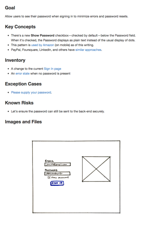
There are five or six sections, depending how you count it. Here’s a sample.
Goal
Part of our culture at Appiphony is asking, “what’s the goal?” at the start of anything. (It’s great for meetings; try it sometime.) I often go with a simple “Allow users to…“ since that’s natural for developers. If you want to zoom out a bit, that’s great too; you can phrase it as the user’s goal or maybe use a job story. Just make it clear what success means.
Key Concepts
There are usually a few critical things the team needs to understand about a design to fully “get it.” This is where I include those. If I can anticipate some questions ahead of time, I’ll answer them preemptively. You may also want to call out something that’s easy to miss, particularly if it’s tricky to implement. Direct their attention.
Inventory
This is a flat list of each component that’s part of the design. In addition to the screens, don’t forget copy for error/information states, subject lines and body text for email templates, and anything else that needs to be coded or tested. Review this list multiple times.
Exception Cases
I call this out as a separate section because I usually forget some of them, and my partners in QA swoop in and help. They’re almost always able to spot one or two “unhappy paths” through the flow we need to smooth out.
Known Risks
There may be parts of the design that simply can’t be built within the time and budget constraints. Call these out if you know them, and don’t be surprised when the developers add to the list. Once the concerns are all on the table, assign tasks to write just enough proof-of-concept code to determine if the design needs to change to account for reality.
Images and Files
This is a separate section in my document that functions like a list of appendices. Depending on the tools you use, you may be able to place the attachments inline where they apply to support your ideas with visuals. Don’t just use words.
The Point
To paraphrase Scott Berkun, nobody wants your requirements. They’ll be OK with theirs, though. Engage your people to define the details and everyone will benefit.
You hired smart people, right? Bring your technical teams ideas at a medium level of grain and tap into their talents. They’ll contribute ideas you never would’ve considered, and some you didn’t even know were possible. You’re a smart cookie, but not the only one in the jar.