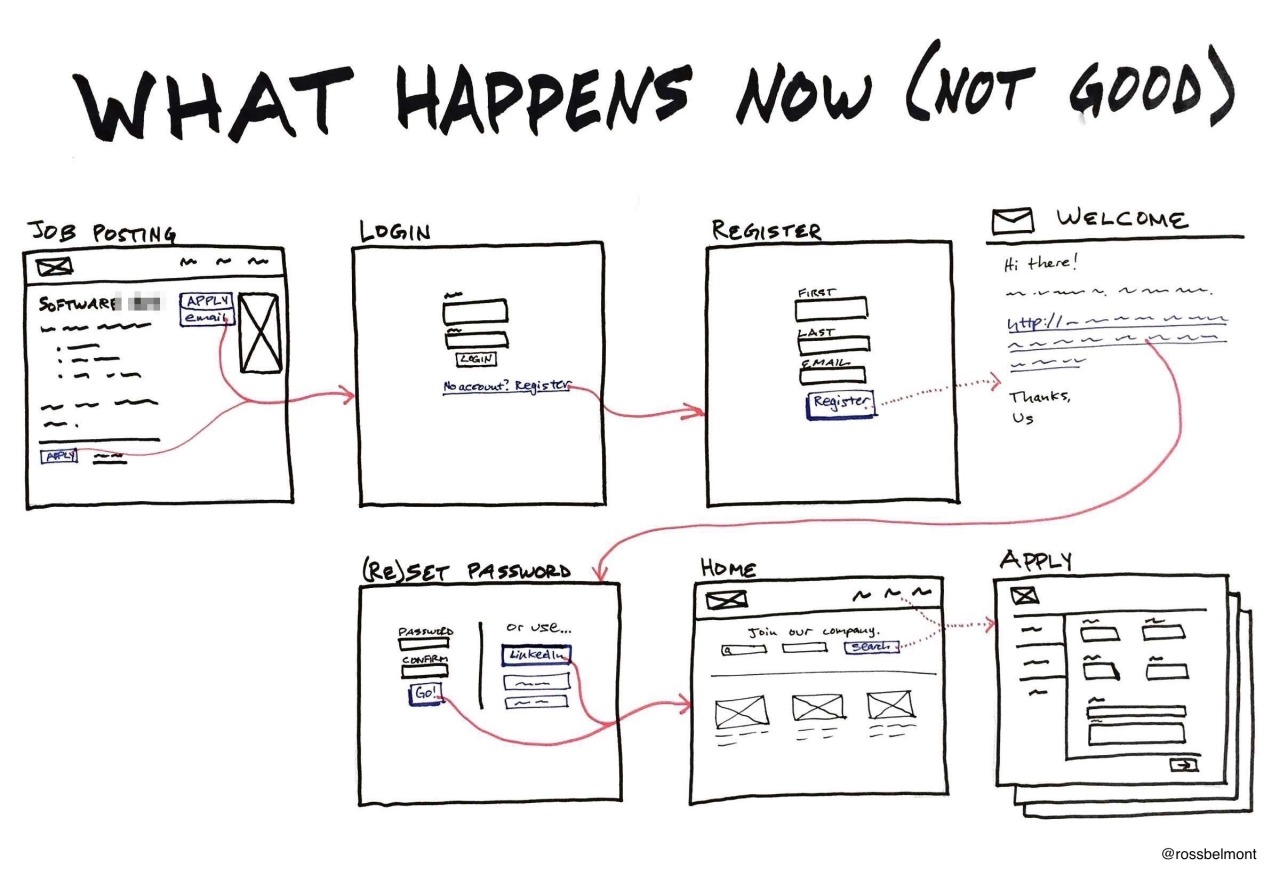
Current State Vs. Future State
I’m one of those people who loves to see the details of how others do their jobs—especially if it’s similar to mine. So I was very grateful when Abi Jones, a designer on Google’s Search team, tweeted a UX comic she drew at work.
The lack of ceremony is great, but the light bulb moment for me was the contrast between the suboptimal current state and ideal future state. I realized the majority of my design work is for net-new functionality, and I needed a different way to pitch reworking something we already have. I made two separate images, but ideally they would fit on one page.
Thanks, Abi!


