Using Narrative to Connect with Customers, Users and Everyone Else →
How does your message fit within the interconnected web of stories that defines their worldview?
How does your message fit within the interconnected web of stories that defines their worldview?
Amazon.com kicks off new product initiatives by writing a hypothetical press release announcing the arrival of the product, then iterating on that message until the vision is sufficiently compelling. It’s a fantastic technique, but it results in a few hundred words. Their release notes, however, provide an example of how to distill that message into a (much shorter) elevator pitch.
Here’s a recent update to the Kindle app:
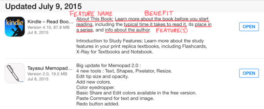
First, they introduce the new feature—branding it, if you will. Then, they call out the benefit the feature creates. Finally, they list the actual feature(s) and provide some details on what it does.
The subtle, but critical ingredient here is highlighting the benefit users will get. If you scroll though your app updates, you’ll see that’s few and far between. Most vendors just list the features, like the one that happened to follow Amazon here:

A prior update to the Kindle app followed Amazon’s pattern:
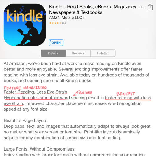
The branding is not as strong, but we still see the benefit—even though improvements to typesetting and visual design can be tough to capture in words.
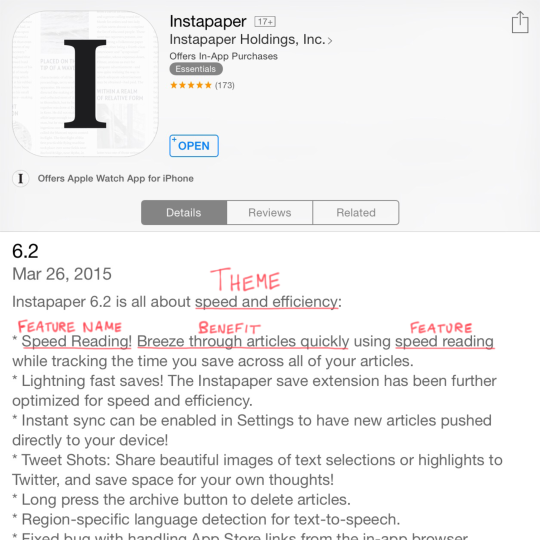
Instapaper had a theme for a recent release, which gave them an easy way to explain why a certain set of features arrived together. Without that, a update can feel like a grab bag with no clear “hook” for customers to understand it holistically.
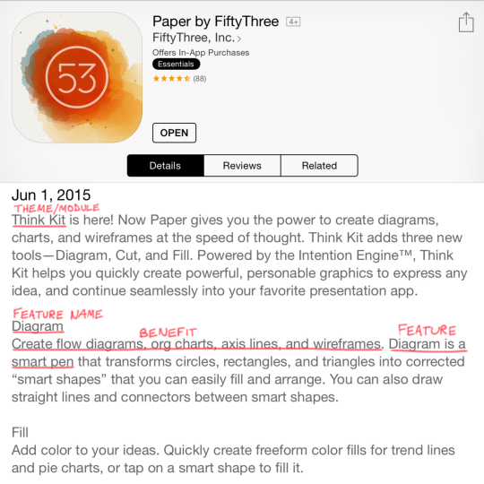
FiftyThree did something similar when releasing a new module for their Paper app. They introduce/brand it, give a quick overview, and then touch on each tentpole feature and the benefit it provides. In their case, that translates to an easier way to accomplish what was tedious in the past.
If you’re building technology for the enterprise, you’ll probably need to include the target user(s) served by the new feature, for example:
System administrators can protect corporate data if a mobile device is lost or stolen with the remote wipe capability introduced with iOS 4.
Once you add that element, you have something that lines up nicely with the Customer-Problem-Solution framework from Lean Startup. If you’re already using that approach, you’ll have a great starting point for this exercise.
Whatever you do, begin with the end in mind so you have more than a list of features when it’s time to ship. Remember: code is a liability. The benefit it creates is the asset.
If there’s one book I wish I’d had in the beginning of my career, it’s Dan Roam’s Show & Tell. The book walks you through improving any presentation with three simple rules:
I use Dan’s advice and templates almost every week, and I’m starting to see the pattern in other places. Salesforce’s marketing execs gave an overview of their major product offerings at a recent event, and I saw these key elements in their presentations.
The pitch for their new analytics product had all three pieces. There’s a clear story line starring a persona named Jackie, and the sense of truth is built by the realism of the scenario and the pictures of the product proving it’s not vaporware.
Strengthening Each Area
Dan’s approach can also be used as a framework for critique to improve the pitch, for example:
Other portions of the keynote emphasized story, truth and pictures to different degrees, and you can see how that effects the results. This video about GE Capital had top-notch production values, but contained at least three different messages:
Those things are probably all true, but saying them all at the same time creates fog around the narrative. Editing can be gut-wrenching, but it’s better to end up with one clear story.
Surprisingly, there was also an piece of the keynote which was literally just a story. This wedding day disaster could have been lifted from a romantic comedy, but it wasn’t possible to include any pictures to reinforce it. It was all tell and no show, but too many people “believe it when they see it.” I’ve found an unexpected link between pictures and truth, at least for stories about products.
Product or no, your next presentation will be better as a story, with truth that resonates and plenty of pictures. Try it.