Inside Apple And IBM's App Making Machine →
Apple helps IBM design enterprise apps by starting projects with a three-day workshop in which they work out the key aspects of the app.
When IBM gets an order for an app such as Passenger+ from one of its enterprise clients, it invites key members of the client’s team in for a three-day workshop at Apple’s Cupertino campus. At the beginning of Passenger+ development, Air Canada sent IT people, managers, and flight attendants to the workshop to hash out the basics.
This is similar to the process we use at Appiphony. Though there isn’t time to sort out every tiny detail in a few days, the group has reached consensus on the core elements of what the app will do and how it will work.
Note the emphasis on talking to the actual end users of the app.
In addition, Apple requires that end users from the client—such as flight attendants in the case of Passenger+—are there to provide their unique view of what they need from an app. The company believes that this step is essential for prompting an immediate “Oh I know how to use that” reaction from the people who will actually use an app, one app designer told me. It also cuts way down on the training time needed to initiate new users.
Miller-Sylvia told me that this insistence from Apple doesn’t always play well. “You can’t imagine how much push-back we get from the client, because the managers think they know,” she says. But “all of the transformation comes from the end users being involved. There’s so many things that they do, and the managers end up getting surprised in the sessions and saying, ‘We had no idea.’”
During one workshop, one of the end users explained: “When I need to do that, I just write it on my hand,” Sylvia-Miller recalls. “And the manager was like, ‘you what?!’” It’s exactly this kind of nitty-gritty day-to-day work reality that gets exposed during the three-day workshops—things a middle manager might never know about.
It’s odd how this is seen as problematic given that it costs so little in time and money, and almost every company talks with customers after products are delivered to gauge customer satisfaction, Net Promoter Scores, etc.
Empower Your Users — Appiphony Insights →
Delight is great, but people at work want to be empowered.
Five Lessons for Product Designers from Google Ventures
Braden Kowitz, a Design Partner at Google Ventures, gave a great presentation at the the 2015 Prototypes, Process and Play conference consisting of five pieces of advice for those that do product design work.
- Work with management and redirect their energy like an akido master. Don’t fight when their design ideas aren’t great; instead, figure out a way to be “facing the same direction.”
- Focus on working through the risky elements of your product or service first, and don’t be surprised if it pulls you out of your personal comfort zone. If it didn’t, it wouldn’t be risky!
- Avoid spreading your design team too thin by setting priorities with senior management. Make sure to include a choice for teams to complete less important projects without design, and communicate what that means.
- Set tight “learning deadlines” to avoid over-polishing a given idea. It’s not always obvious when designers should put their pencils down.
- Design activities should be done by everyone on the team—at least a little—to instill the sense that design is everyone’s job. Developers can watch usability tests and go on site visits, for example.
At the end of the session, there was a brief Q&A in which someone asked about how to balance science with art and go with your gut. I really liked Braden’s answer, which I’ll paraphrase:
When there’s no hard data available, make decisions by identifying who has the best instincts for that type of decision, whether they be a visual designer, sales rep, support agent, or the CEO. Let that person decide, and call out the fact that you’re in subjective territory.
How to Handle Design Feedback on Tight Timelines
There are two kinds of designers: those who’ll admit they’ve had trouble handling feedback, and liars. That’s why the new book Discussing Design: Improving Communication and Collaboration through Critique caught my attention. The authors (Adam Connor and Aaron Irizarry) shared a number of useful concepts around design critique that I folded into our process. This post is an overview of what we changed; I encourage you to read the book and apply the lessons in your work.
The Bigger Picture
The improvements we’ve made around critique act as a bookend to another recent process change in how we collaboratively generate a high-level design direction for a given set of features. Simply put, we come up with the basic ideas together, and we evaluate the full-fidelity designs together.
This is a subtle point, but it’s critical. Since all of our fingerprints are on the designs, no one feels like they’re in front of the firing squad during the critique. Even if one person did the lion’s share of the detailed design, they can still switch hats and be a critic.
The 75/25 Process
As it relates to critique and iteration, the basic process is as follows:
Collaborate on the high-level design direction for a given set of features, but don’t use more than 25% of the available time.
Pause and evaluate the design concept against the higher-level project and business goals. (Whenever possible, also compare it to what you’ve heard from customers and users.) Decide whether you need to change direction, then select a solution.
Prototype that solution, but don’t use more than 75% of the available time.
Pause and analyze the effectiveness of the prototyped, high-fidelity design relative to the finer-grain objectives of that specific design. Identify improvements to make.
Use the last 25% of the time to make as many of the improvements as possible.
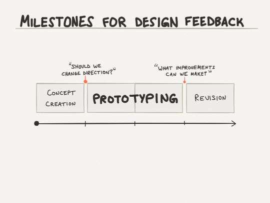
The 75/25 rule sounds a little arbitrary, but I borrowed it from Pixar. Without Lean-style pivots, a quarter of the way through is about the last responsible moment to change direction. And to make non-trivial improvements, developers will need at least 2-3 days in a typical two-week cycle (i.e. 20-30% of the time).
You can also look at the flip side: early on it’s too soon to nitpick, and later on it’s too late to make fundamental changes. In the middle, you mostly have to leave people alone and let them work.
Critique: Effectiveness Analysis
Adam and Aaron’s book gave me what I was missing to structure the critique session into something that’s a useful input to design. First, framing the session as one focused on analysis gets people into a critical thinking mindset. Try your best to keep people in an evaluative mode instead of slipping into a problem-solving mode. (There’s no magic trick to this; just stick to your guns and emphasize that you really want to devote this time to smoking out all the improvements you possibly can.)
A natural extension of the analysis is an articulation of the objectives. (I specify the key objectives in writing.) Explicitly discussing your targets is key to knowing whether they’ve been hit. In the book, the authors use the term “objectives” as a catch-all to capture anything the design should be factoring in:
Your personas and their goals
Your project’s business goals
The scenarios that have touch points into these features
Any design principles agreed upon by your team
Any relevant best practices for your target platform
and so on…
Depending on your culture, having a forcing function for a discussion of objectives might just be the biggest impact of properly managing design critique.
When the Going Gets Tough
The thing I’m most grateful for about the book is the frame of mind that helped me come up with these sentences during some uncomfortable moments:
“I hear what you’re saying about that [specific design element]. Can you tell me more about the problem you feel is inadequately solved by what we’re seeing now?”
“I can tell you’re not in love with this, and that’s OK. Which parts of this design seem to lack effectiveness?”
“Hmm, that’s interesting. I wonder if we should reframe this objective, perhaps significantly. Or have we identified an entirely new objective?”
“That’s a powerful idea, but it would take us in a new direction. Can I talk to the development lead and get back to you?”
Stakeholder issues a directive; “We can take that specific directive, but I’d like to go further; anything you can tell me about the line of thinking behind that will help me apply the same idea elsewhere.”
Though you might be bracing for impact, you may very well hear reactions you don’t expect. Depending on their personalities, some stakeholders may not make any decisions on the spot and ask for time to think things over. This feels anticlimactic, but it’s healthy. I think it’s part of the reason why the authors included a detailed example of sending the stakeholders the designs in advance(!) so that they can mull them over beforehand.
Are You Ready to Get Better?
I would definitely rather hear gushing praise instead of outright insults, but neither contain information I can use to improve the design of a product.
So why not use every available method to make things better? If Pixar does it, shouldn’t you? If engineers do code reviews, shouldn’t you do the same?
How to Write Great “Elevator Pitch” Release Notes Like Amazon
Amazon.com kicks off new product initiatives by writing a hypothetical press release announcing the arrival of the product, then iterating on that message until the vision is sufficiently compelling. It’s a fantastic technique, but it results in a few hundred words. Their release notes, however, provide an example of how to distill that message into a (much shorter) elevator pitch.
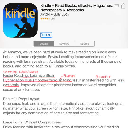
Here’s a recent update to the Kindle app:
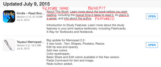
First, they introduce the new feature—branding it, if you will. Then, they call out the benefit the feature creates. Finally, they list the actual feature(s) and provide some details on what it does.
The subtle, but critical ingredient here is highlighting the benefit users will get. If you scroll though your app updates, you’ll see that’s few and far between. Most vendors just list the features, like the one that happened to follow Amazon here:

A prior update to the Kindle app followed Amazon’s pattern:
The branding is not as strong, but we still see the benefit—even though improvements to typesetting and visual design can be tough to capture in words.
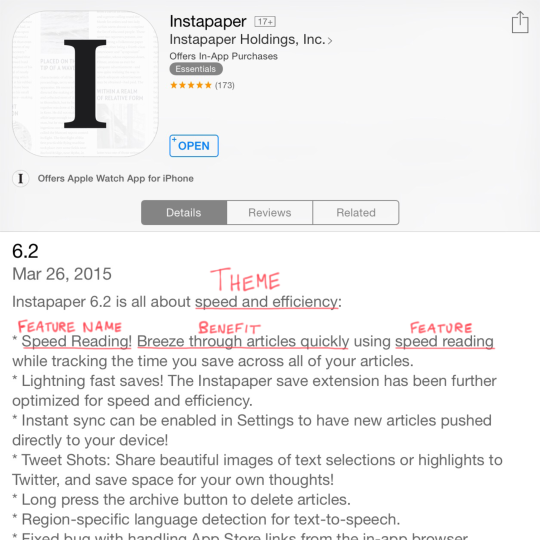
Instapaper had a theme for a recent release, which gave them an easy way to explain why a certain set of features arrived together. Without that, a update can feel like a grab bag with no clear “hook” for customers to understand it holistically.
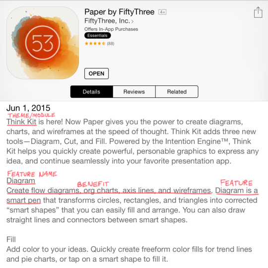
FiftyThree did something similar when releasing a new module for their Paper app. They introduce/brand it, give a quick overview, and then touch on each tentpole feature and the benefit it provides. In their case, that translates to an easier way to accomplish what was tedious in the past.
Adding the “Who”
If you’re building technology for the enterprise, you’ll probably need to include the target user(s) served by the new feature, for example:
System administrators can protect corporate data if a mobile device is lost or stolen with the remote wipe capability introduced with iOS 4.
Once you add that element, you have something that lines up nicely with the Customer-Problem-Solution framework from Lean Startup. If you’re already using that approach, you’ll have a great starting point for this exercise.
Whatever you do, begin with the end in mind so you have more than a list of features when it’s time to ship. Remember: code is a liability. The benefit it creates is the asset.